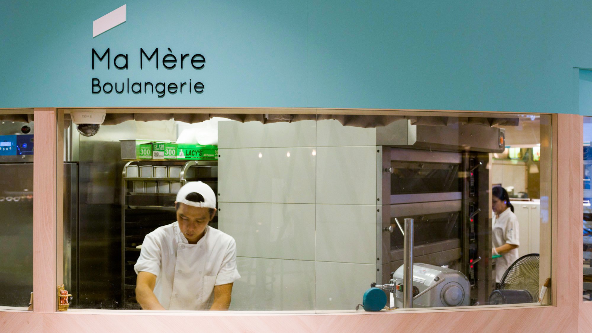
Ma Mère Boulangerie, translated as “My mother’s bakery”, is a specialty bread shop in Singapore.
Inspired by a sheaf of wheat, the key ingredient of bread, IMMORTAL created an upward dash that’s coloured in an unexpected shade of aquamarine.

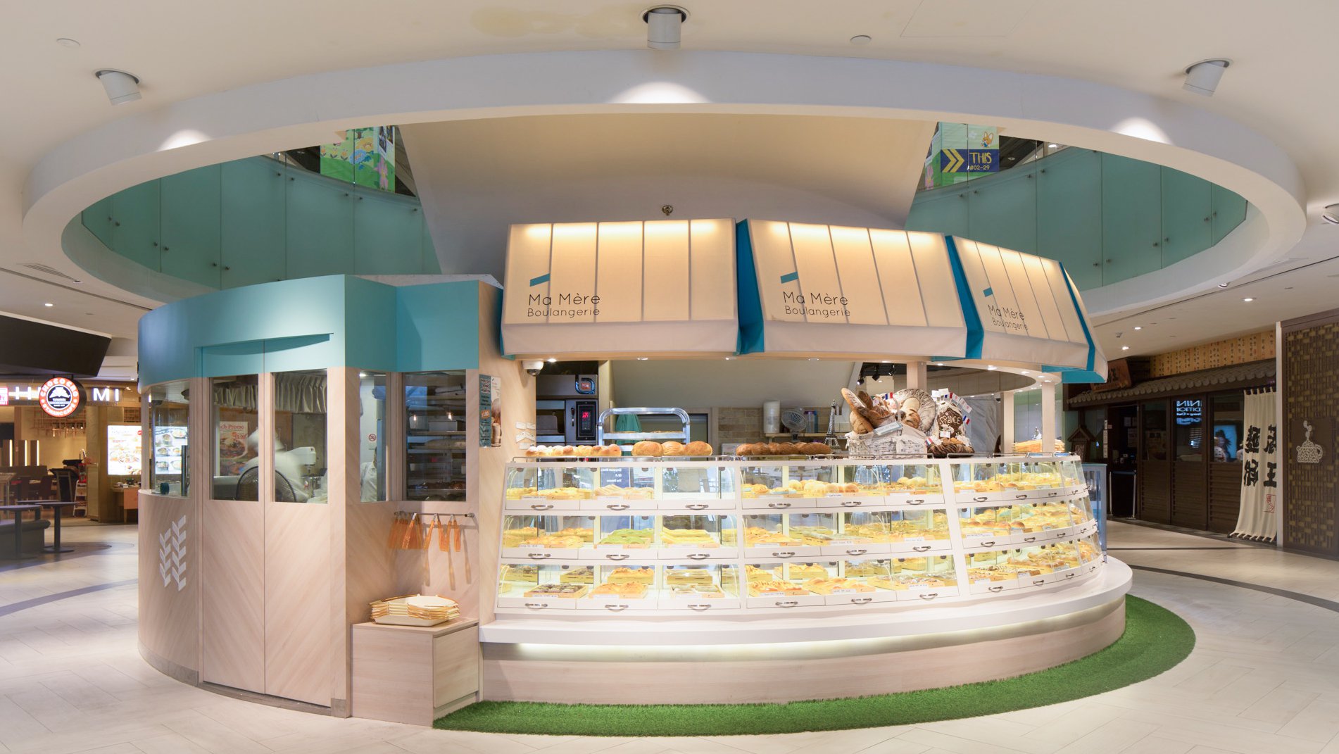
The bakery offers a tempting array of freshly baked buns, scones, muffins, cakes and other pastry-based creations.
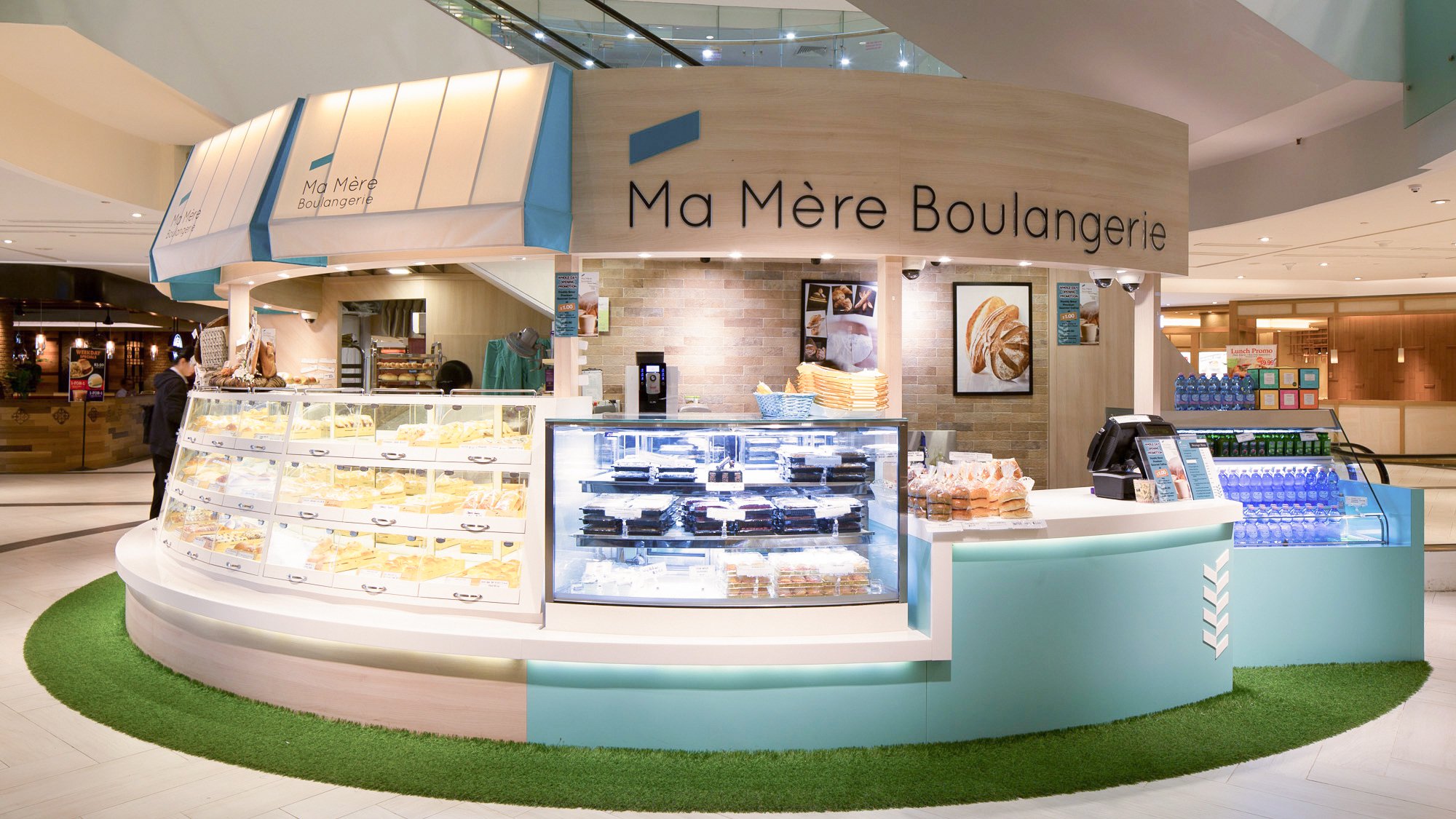

The stylised agricultural motif becomes a subtle part of the brand name as well as a contemporary visual identity.
The brand identity has been applied on-site. It is also featured on the packaging system comprising bags, stickers, tape, boxes and carriers.