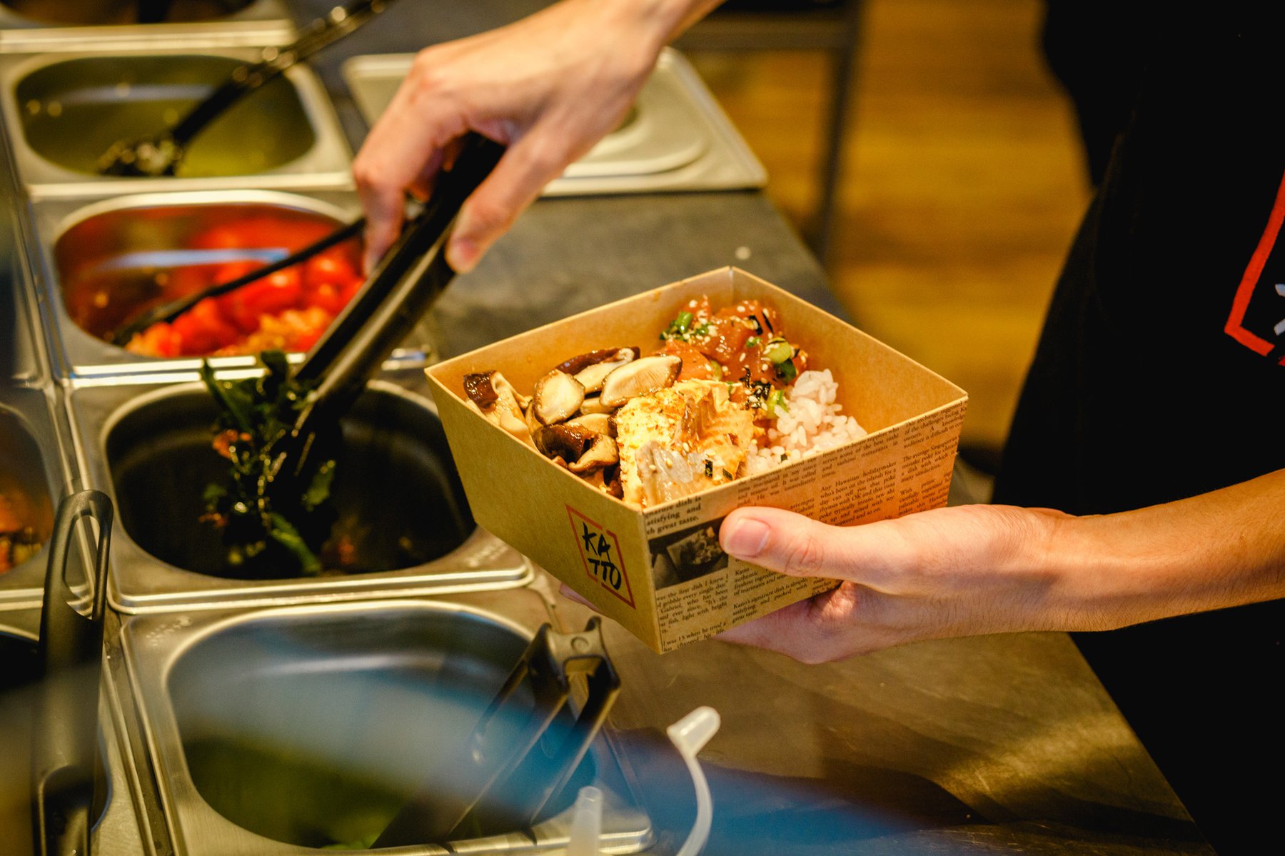
Katto, founded by two Singaporean brothers, is a café specialising in Poké, a raw fish salad of Hawaiian origin that is fast gaining popularity as a healthy all-in-one meal.

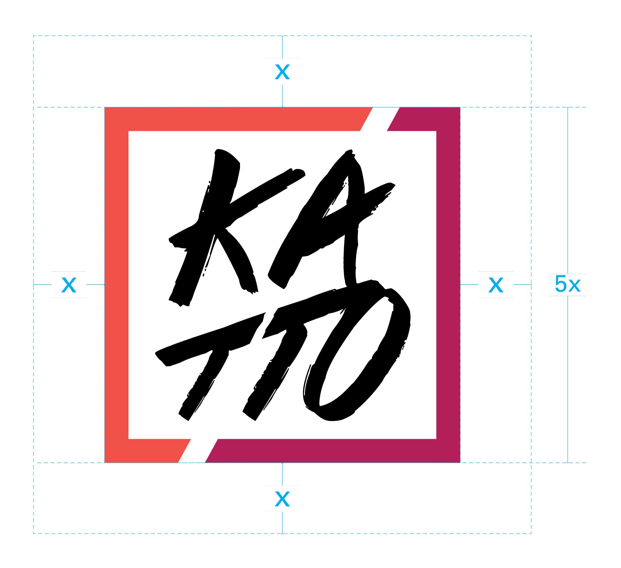
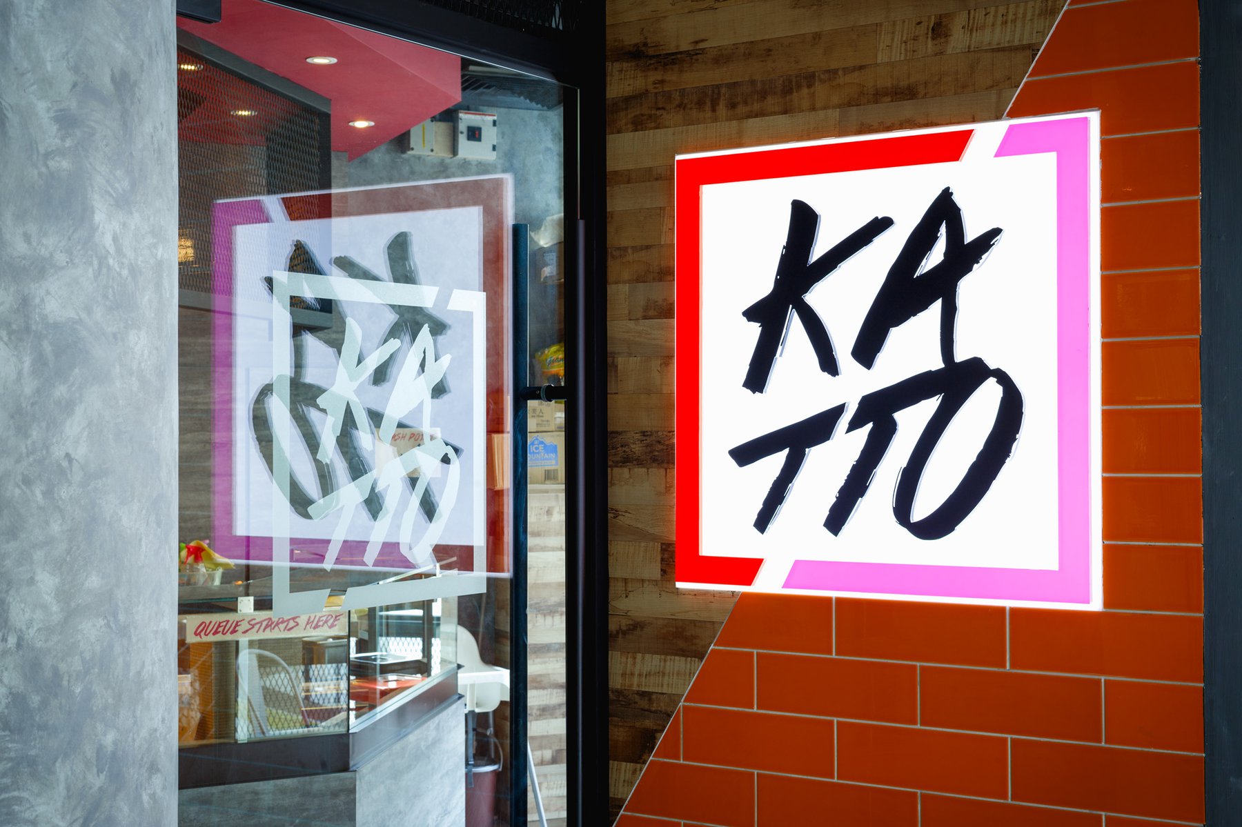
The name Katto was derived from the Japanese transliteration of "cut" reflecting the sliced or cubed portions of fresh fish added into the dish.
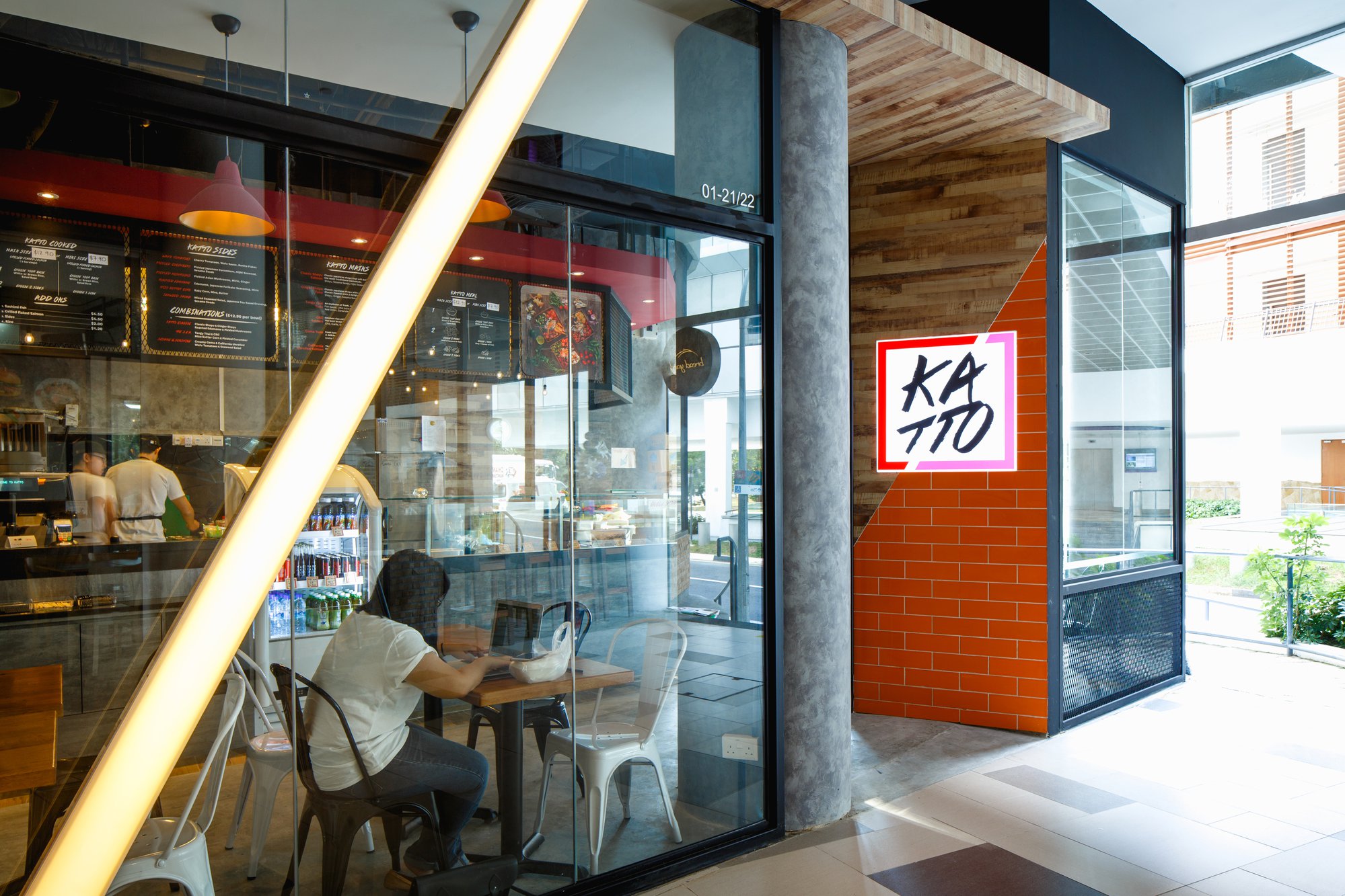
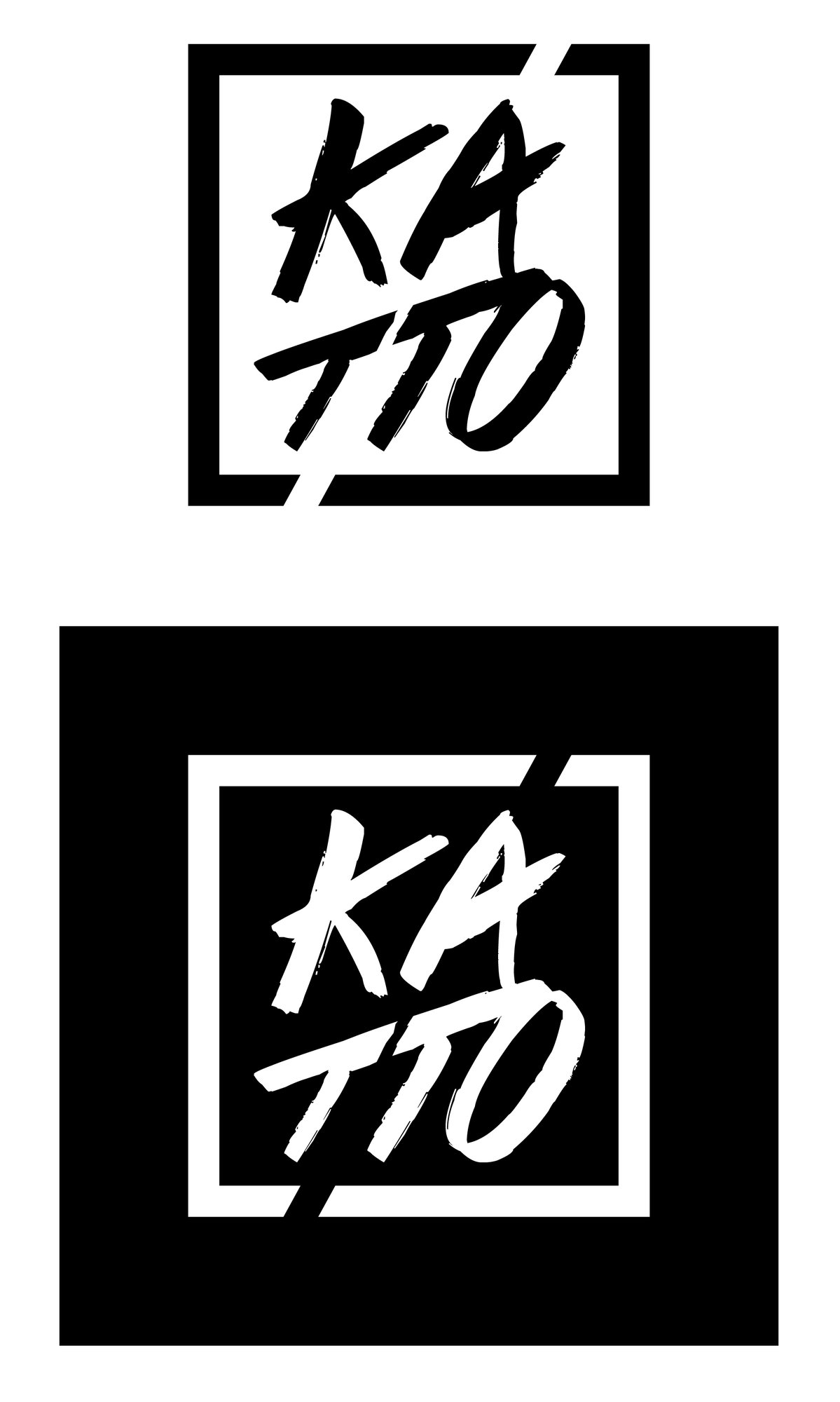
The colours on the brandmark reflect that of tuna and salmon, the main ingredient in Katto’s Poké. The brandmark can be found on the premises, packaging and all employee uniforms.
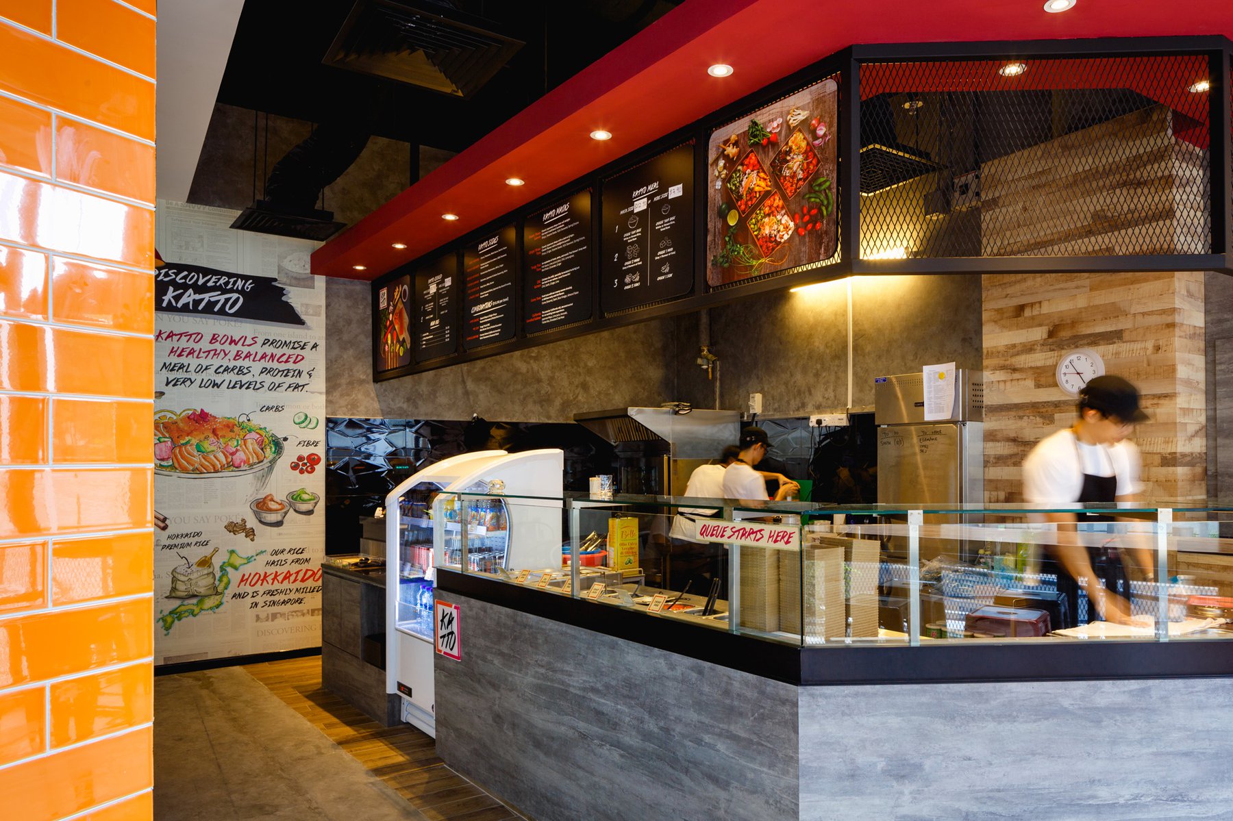
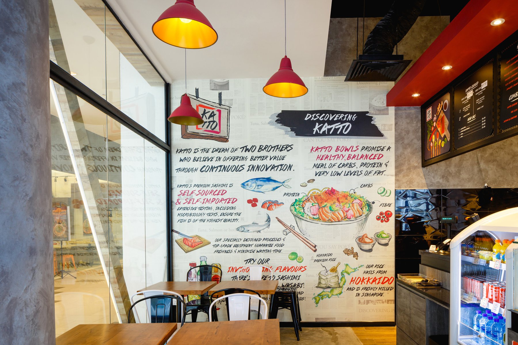
To increase engagement with the customer, a wall-sized mural illustration was created to explain Poké’s origins and healthy appeal.