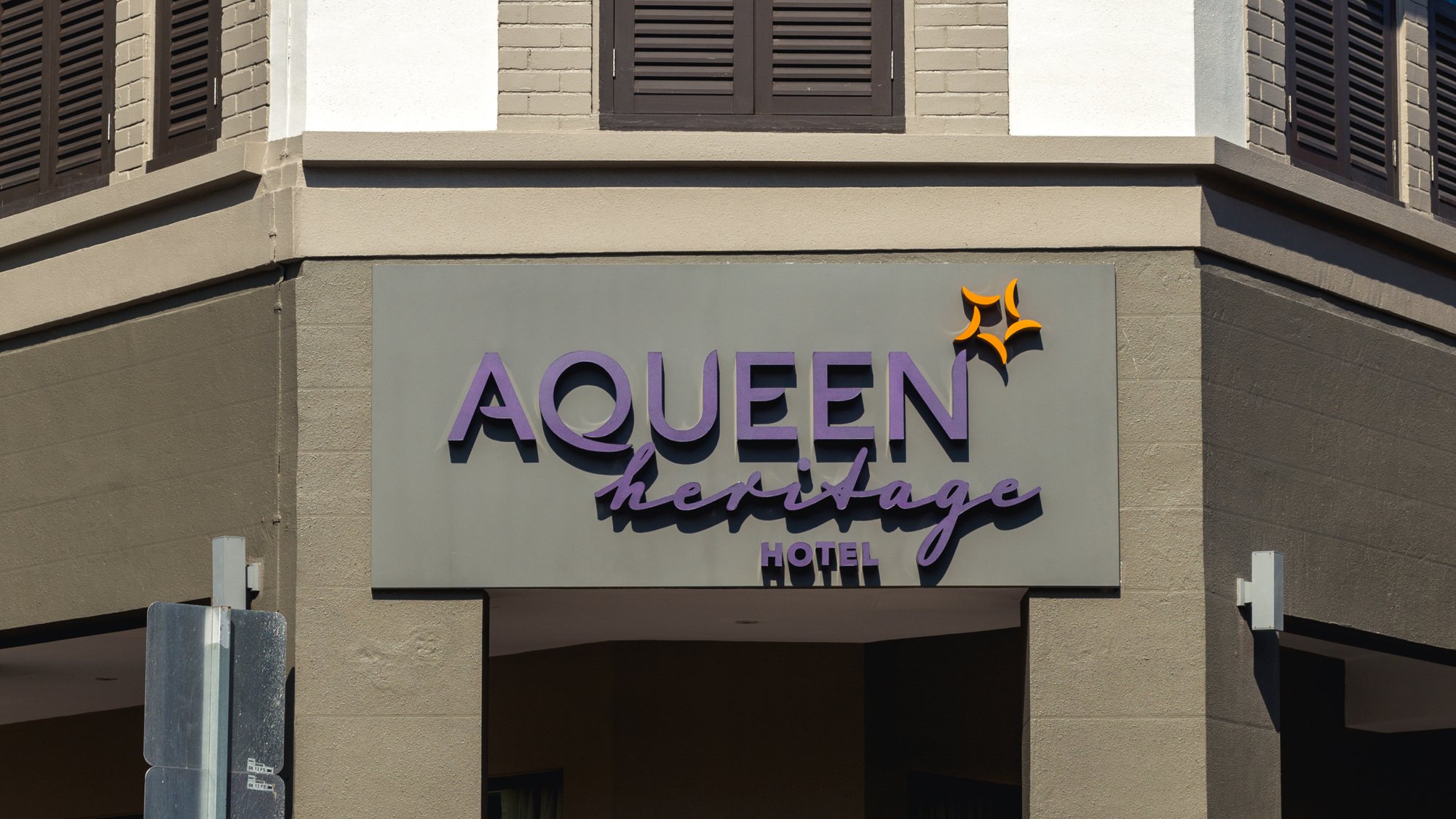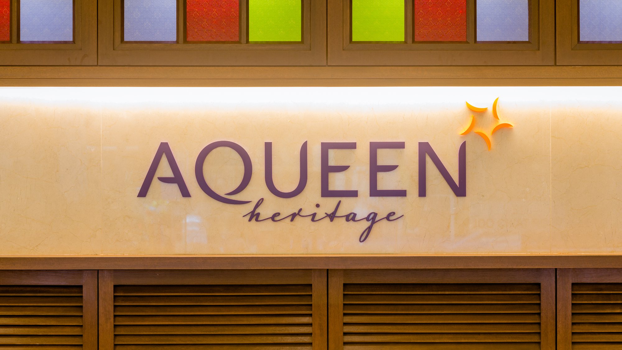

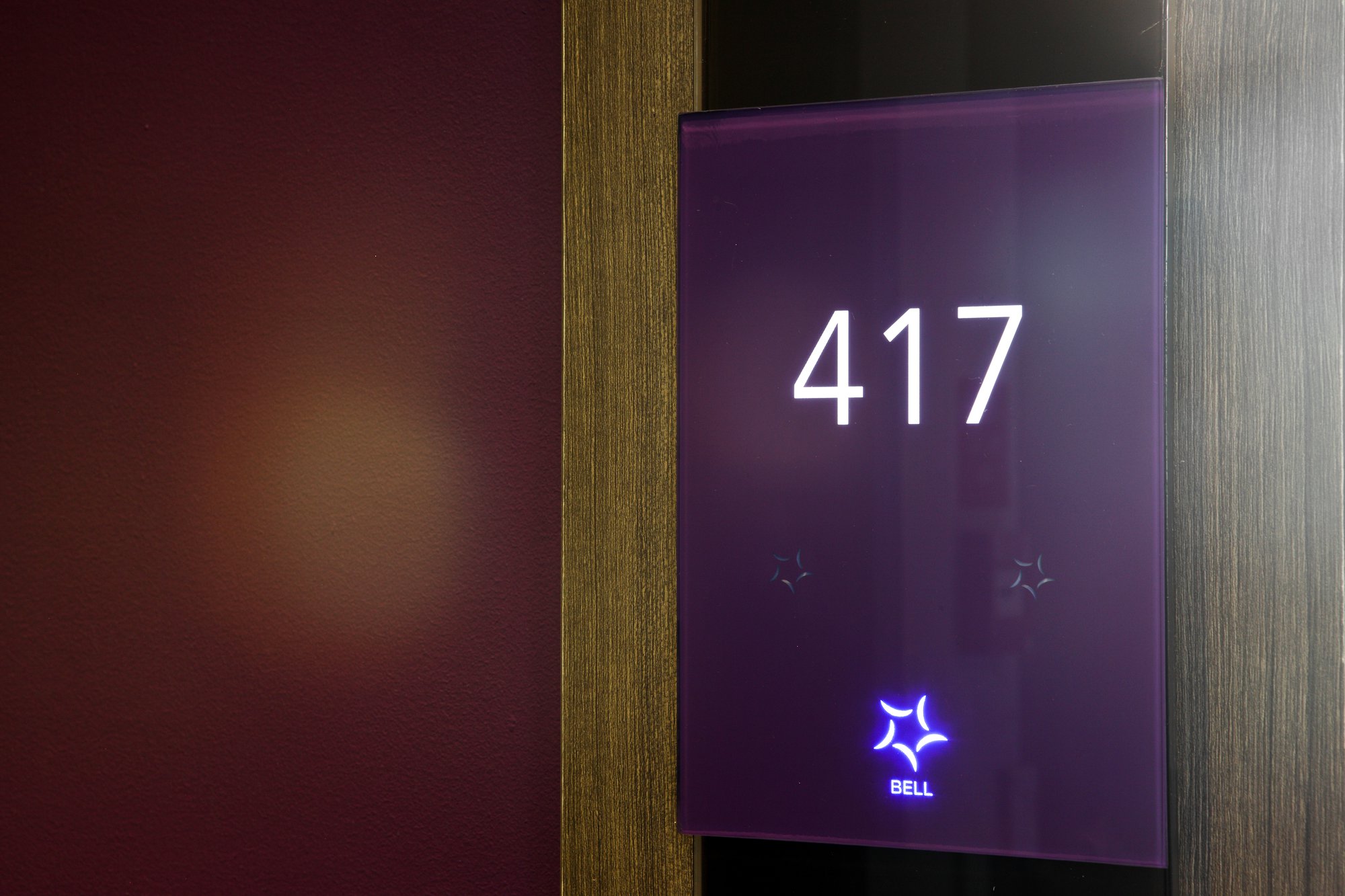
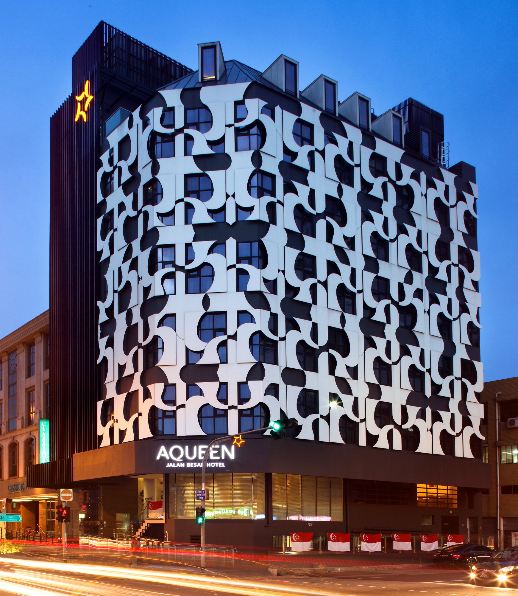
The brand visual identity includes a star-inspired icon of five feathers. This is a symbol of hospitality.
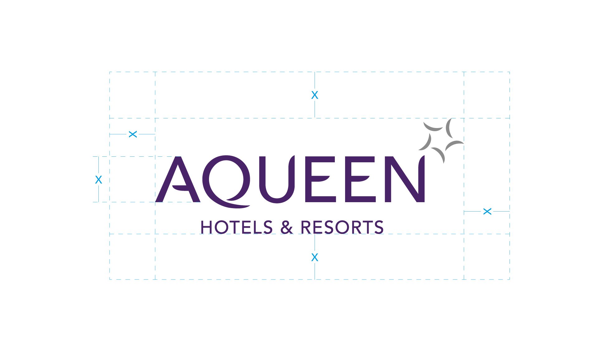
Following a brand audit, a strategy report was articulated, along with the brand architecture and naming system.
A secondary graphics scheme was assembled, comprising motifs inspired by the star and feather graphics and colour scheme of purple and orange.
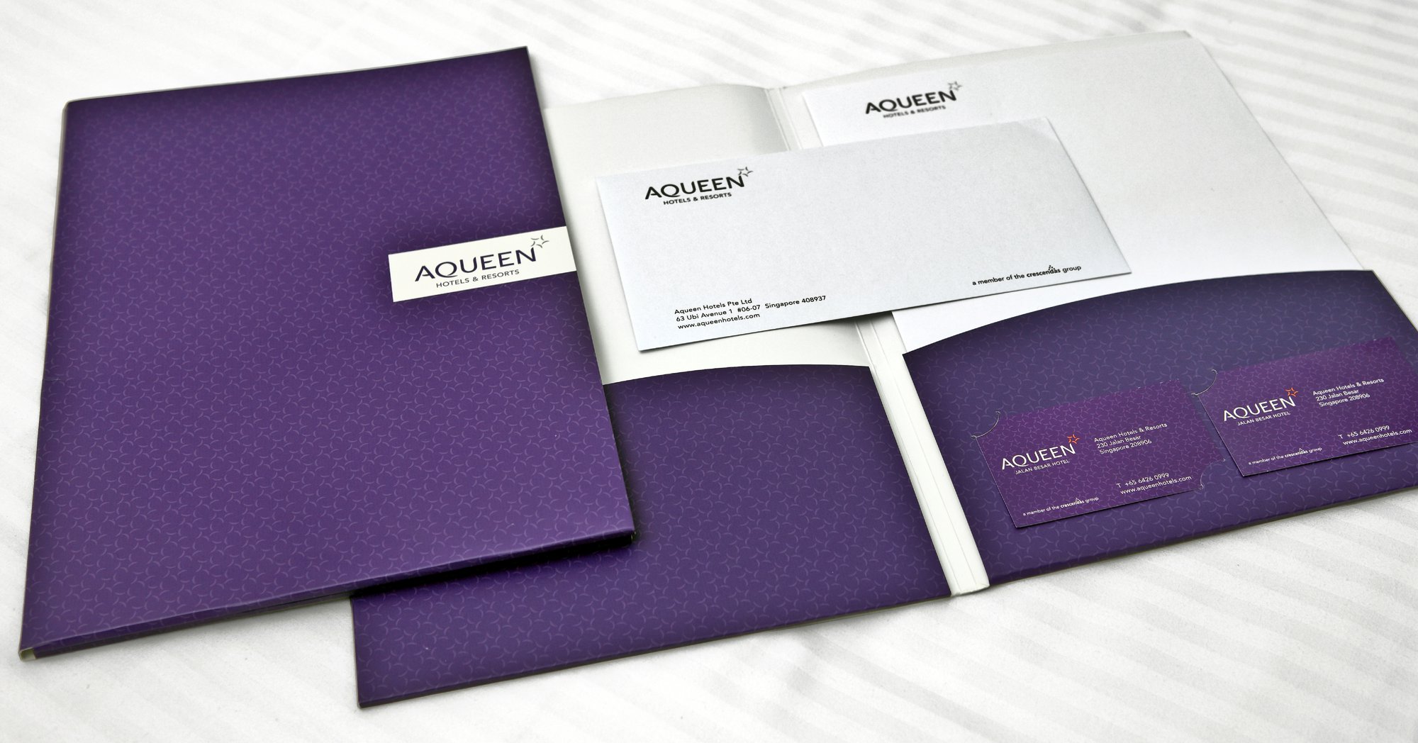
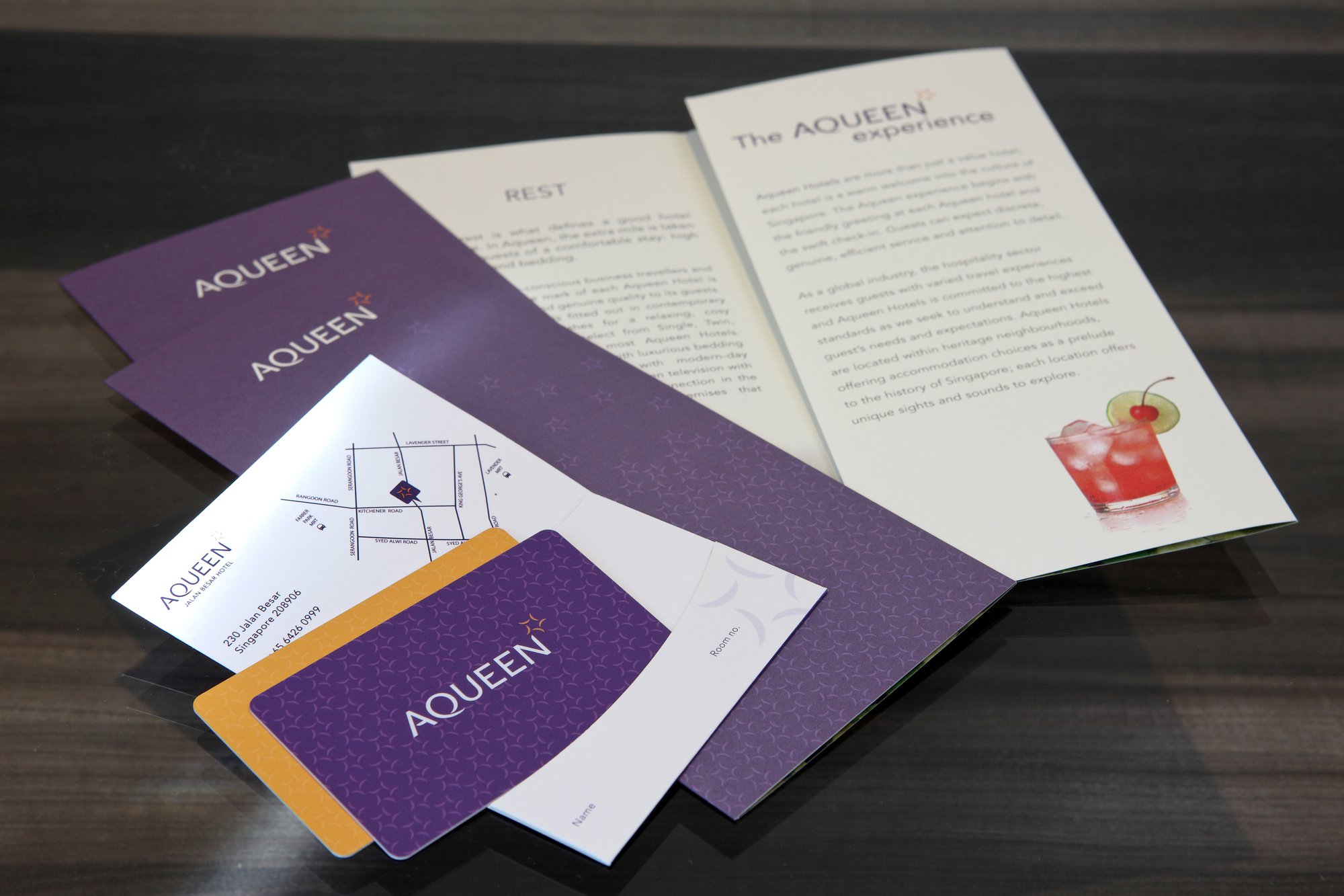

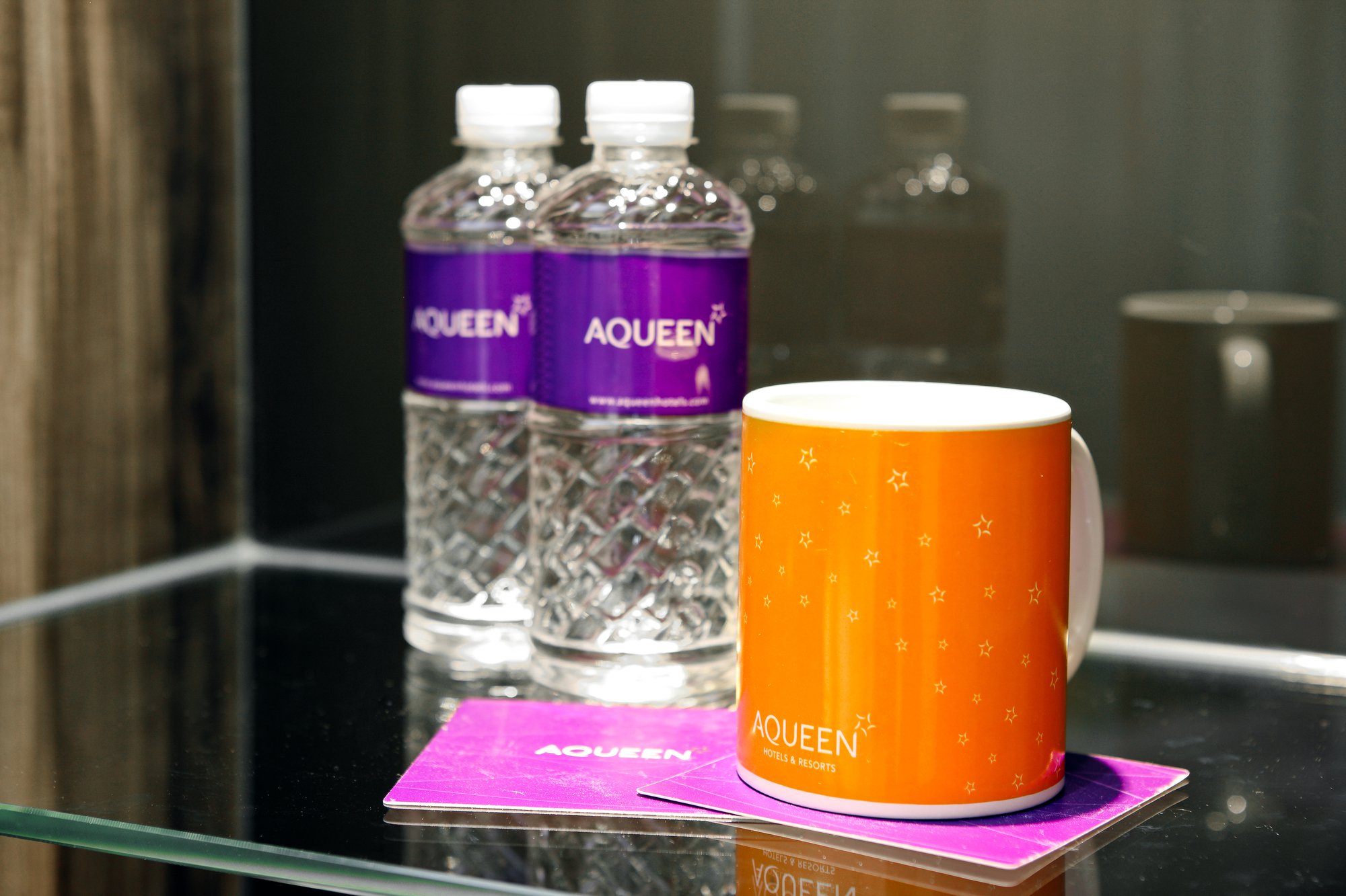
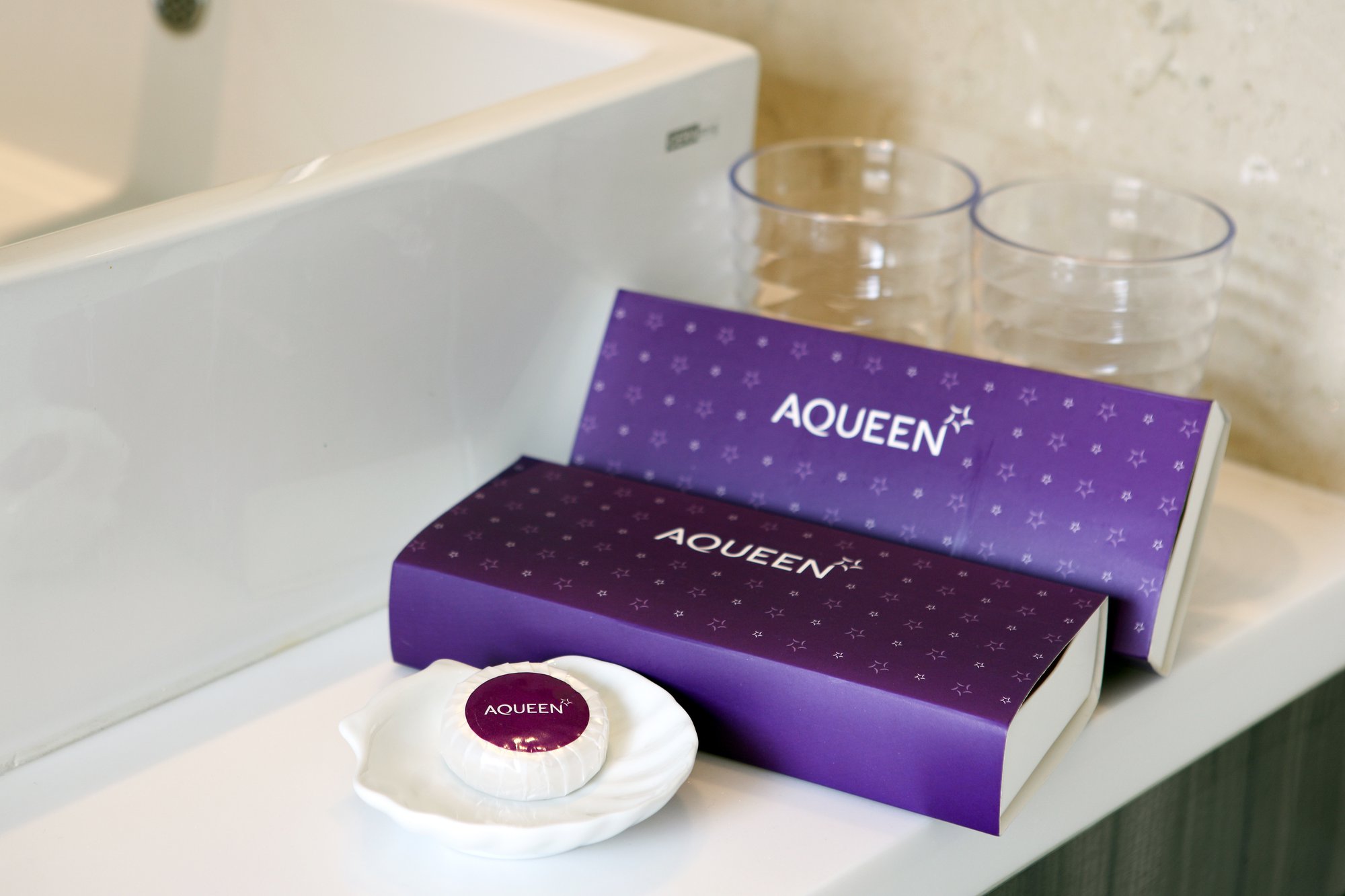
The brand identity is expressed on a selection of marketing collateral and in-room items, communicating a visually cohesive stay experience.

Immortal also designed the identification signage for the Aqueen properties.